Unit A2 - Colour and line
Colour is often the first thing to strike us about a painting. When I showed the case study paintings to students, colour was one of the things each student commented on. Often when we want to explain why we like a painting, we resort to phrases such as "I like the colours". Nobody can argue with that sentiment. Yet if we want to think about the ways in which paintings manipulate colour, we need to try and find ways of discussing colour more clearly, and of analysing its effects and its role more precisely.
Fortunately, even though colour seems highly subjective, with the help of a few basic concepts and tools it is possible to begin to understand some of the rich ways in which colour in art and the varied ways in which artists use it. In the first unit of this course, then, we shall explore some key aspects of this complex notion.
We shall also discuss a closely related issue: the question of line.
This unit has five sections:
We shall begin in section a by discussing the idea of palette, the notion of the colour wheel, and the ways in which terms such as "complementary pairs" can help explain some of the effects of colour.
In section b we shall consider the notion of perceptual and local colour.
In section c we shall discuss notions of value, hue and intensity.
In section d we shall consider some of the problems with discussing colour in relation to art from different historical contexts.
Finally, in section e we shall consider the importance of line.
A2a - Coulour and Line: Palette and the Colour Wheel
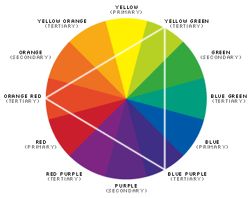
Most of the terms we use to describe colour are relatively recent, dating from methods of analysis developed in the eighteenth century. The basic colour system is derived from the way in which white light, when passed through a prism, can be broken down into a spectrum of pure colours.
In his book Opticks (1704), Isaac Newton set out colours as though they were arranged around a wheel. For an example of a colour wheel, click here (external link). The colours described as the primary colours (red, yellow, and blue) are spaced equally around the circumference of the wheel; and between them are the secondary colours (orange, green, violet), which are formed by mixing the primary colours. Intermediate colours are made by mixing a primary and neighbouring secondary colour.
The colour wheel is extremely useful in understanding some of the effects which are produced when colours are placed side by side. Colours which sit side by side on the wheel seem harmonious; these are called analogous colours. Those which lie opposite each other on the wheel are called complementary pairs (ie, orange/blue; yellow/violet; red/green), and contrast violently when juxtaposed. (Newton found that if complementary pairs are mixed together, they cancel each other out; if they are in the form of coloured light, they produce a pure white; and if they are in the form of coloured paints, they produce grey.)
The use of adjacent complementary colours to create contrasts was theorised by Michel-Eugène Chevreul in De la loi du contraste simultané des couleurs (1839); drawing on this work, we term the use of complementary colours "simultaneous contrast". Complementary colours create a sense of contrast. They also make each colour appear more intense than it would if viewed in isolation.
Although the concept of the colour wheel was only developed in the eighteenth century, it is an extremely powerful tool in understanding colour in art from a very wide range of historical contexts. Indeed, even before the notion of the colour wheel was developed, the Renaissance theorist of art Alberti discussed the "friendship of colours", noting the same relationships of harmony and contrast between analogous and complementary colours. Moreover, artists in the Renaissance frequently exploited the relationships between colours, to create harmonies and contrasts.
The very important principle in all of this is that it is not just the colours themselves that are important: it is the way colours relate to each other that counts.
We can build on these ideas to reflect upon the range of colours artists use. Sometimes artists will deliberately restrict the range of colour; some works display a wider range of colour. Where an artist has restricted the range of colour, we refer to the use of a limited palette; a wide range of colours is described as a broad palette.
Activity (i)
Look at this painting by Max Beckmann, entitled Adam and Eve (1917): click here (external link). It shows Adam and Eve in the Garden of Eden, tempted by the serpent. This is a very disturbing painting; one of the reasons for this is its use of colour. Identify the colours being used by Beckmann. Is the palette limited or broad? Are there complementary colours being used, or any examples of analogous colours? What are the effects of this?
When you have noted your thoughts on this painting, click here to compare your ideas with mine.
Activity (ii)
Look at this painting by the Italian Futurist artist Luigi Russolo, entitled Music and painted in 1911: available here and here (external links).
How is the artist exploiting the different relationships between colours on the colour wheel? What effect do you think this has? How might this make you think of music, and what sort of music do you imagine?
When you have noted your thoughts on this painting, click here to compare your ideas with mine.
Unit A2b - Colour and Line: 'Local' and 'perceptual' colour
Activity (iii) Look at Monet's Haystacks at Noon (1890-91) (click here). Try and identify the dominant colours in this painting. How do they fit on the colour wheel?
When you have noted your thoughts on this painting, click here to compare your ideas with mine.
One of the major developments in French nineteenth-century art was an interest in the way colour was perceived in particular conditions ('perceptual colour'), rather than the way it actually was, or we would expect it to be ('local colour'). In a famous passage written in 1856, Eugene Delacroix described how he noticed that strong contrasts of light and dark produced effects of colour: "a small urchin had climbed up on one of the statues of the fountain in full sunlight: dull orange in the lights, the most brilliant violets for the transitional passages into the shadow, and golden reflections in the shadows thrown up from the ground. The orange and violet were alternately predominant or else were mixed together."
What Delacroix had noticed was that the half-shadows cast by an object in bright light seemed to be tinted with the colour which was the complementary of the object itself. The orange of the "urchin" thus seemed to produce violet shadows (orange and violet being complementaries).
This notion came to be most commonly used in Impressionism; impressionists were sometimes even diagnosed with "violettomania" because the shadows they painted were so often violet. This observation of "perceptual" colour - the colour an object or area appears to be, as opposed to the way it actually is ('local' colour) - gives rise to the effects of complementarities we saw in Monet's painting. (The development of the representation of perceptual colour was, incidentally, assisted by the new means of grinding paints and of storing them which developed in the nineteenth century - these changes made it easier for artists to work outdoors, and capture the fleeting effects of sunlight.)
Activity (iv)
Look at Seurat's Bathers at Asnieres (1884): click here (external link) . Here are two comments from students:
'It looks incredibly lively & bright, somehow. I don't like the colours they don't seem harmonious but they somehow seem right." "I'm not sure how, but this painting seems grimy and bright at the same time."
What do you notice about the use of colour? What types of colour does Seurat set alongside each other?
When you have noted your thoughts on this painting, click here to compare your ideas with mine.
Unit A2c - Colour and Line: Hue, value and intensity
These are three useful terms to describe the qualities of a pigment. Hue is the intrinsic colour of an object or pigment.
Activity (v)
Assess the use made of colour by Duccio in the 'Descent into Limbo' in his Maestà (1308-11), considering the values and intensity of the colour: click here (external link; Web Gallery of Art).
When you have noted your thoughts on this painting, click here to compare your ideas with mine.
Intensity refers to the extent to which a colour is mixed with another, neutralising colour. As we mentioned in relation to the colour wheel, in section (a) of this unit, mixing colours leads to their intensity being reduced. If a colour is intense, we might also refer to it being saturated. is light and dark. When we speak of the values of a particular colour, we refer to its lighter tints and darker shades, created when white or black is added to the hue.
Unit A2d - Colour and Line: Historical specificity
Although our reactions to colour tend to seem immediate, instinctive even, we need to be cautious when we consider the use of colour in paintings from different historical periods.
Three major problems need to be kept in mind.
First of all, colours on older paintings often degrade so that what we see is not quite what contemporaries would have seen. Pigments which are particularly prone to fading over time are described as fugitive.
It is often very difficult to tell which pigments have been used, especially when you are working from a reproduction of a painting. Even when you are looking at a painting directly, it is not always easy to determine which pigments you are dealing with, and chemical analysis is necessary. Sometimes in scholarship the names of pigments are referred to, which can be confusing, but is important to help you be precise about which colours are being used.
Secondly, ideas about what makes "good" and "bad" use of colour also change. Thus, for instance, in the medieval tradition of painting, purer pigments were preferred, and mixtures of colour were condemned as being not brilliant enough or corrupted. Thus some medieval paintings can seem garish or even naive at first. (This might have been the case with the painting by Duccio we looked at in the last activity.)
Colour has been hotly debated in theories of art. For instance, in the sixteenth century Giorgio Vasari denigrated colour in relation to what he called "disegnoa" a complex term which refers to the concept of design or drawing. But other thinkers have suggested that colour has a powerful, even mystical role in our experience of art. Goethe's Theory of Colours (1810) argued that the contemplation of a single expanse of colour could kindle an awareness of universality and bring you to the fundamental unity of existence. Kandinsky, writing a hundred years later, argued in his book On the Spiritual in Art that colour has a direct impact on human psychology. Other artists have made strong direct links between colours and emotion: Van Gogh, for instance, writing of his painting The Night Cafe, said: "I have tried to express the terrible passions of humanity by means of red and green. Everywhere there is a clash of the most disparate reds and greens."
Finally, often colour is used in quite symbolic ways. This will vary widely in historical contexts. Sometimes, too, particular colours are associated with particular figures or characters for instance, the Virgin Mary is often shown dressed in blue and red. In Giotto's great frescoes for the Scrovegni Chapel in Padova, painted in the early fourteenth century, the figure of Judas is always recognizable in his yellow tunic. (We'll look at a painting from this fresco cycle later in the course when we discuss Action and Narrative.)
Unit A2e - Colour and Line: Line
Line defines a space or object and creates an outline or contour. There are many ways of using line. Line can be: thin or wide; interrupted (dotted, dashed, broken); blurred; freehand; hatched (to create tone and volume); patterned. It is always worth asking yourself how the artist has handled line. Are the contours of the objects emphasised or hidden? What effect does this give?
Activity
Look at these two very different paintings, and notice the ways in which line is being used.
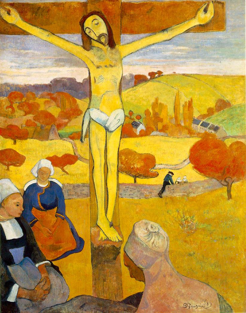
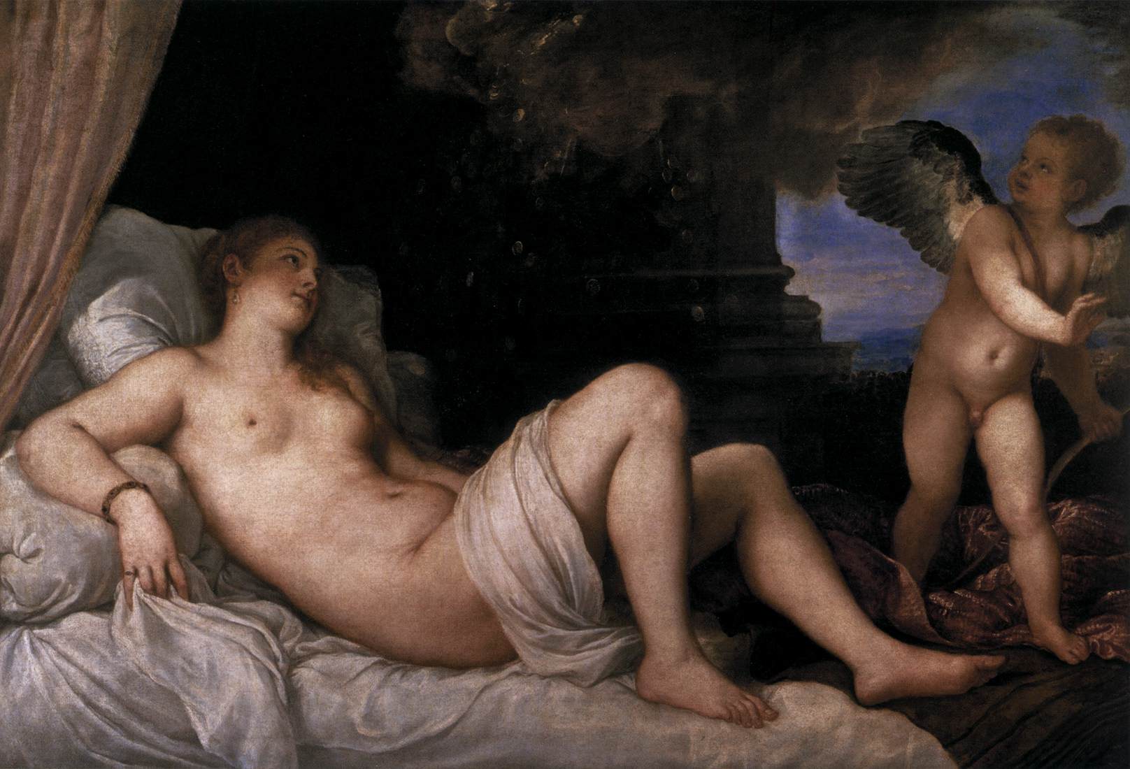
Gauguin's Yellow Christ (1889) - available here; and Titian's Danae and the Shower of Gold (1554) - available here.
Unit A2 - Colour and Line: Further reading
An enjoyable and helpful study of colour, rich in examples taken from the National Gallery in London, is David Bomford and Ashok Roy, Colour (London: National Gallery, 2000). For the use of colour in the Renaissance, see Marcia Hall, Color and Meaning: Practice and Theory in Renaissance Painting (Cambridge: Cambridge University Press, 1992), which includes a very rich series of commentaries on the use of colour in various paintings.
For more on Max Beckmann (activity (i)), the catalogue for an exhibition held in Paris, London and New York in 2002-03 has several good reproductions and some interesting essays (Max Beckmann, ed. by Sean Rainbird (London: Tate Publishing, 2003).
A good introduction to Futurism (activity (ii)) is Caroline Tisdall and Angelo Bozzolla, Futurism (London: Thames and Hudson, 1977).
An excellent book on Duccio is James H. Stubblebine, Duccio di Buoninsegna and his School (Princeton: Princeton University Press, 1979).
There are many books on Monet: one useful example is Marianne Sachs, Monet: Life and Works (London: MQ Publications, 2000).
On Seurat, see Pierre Courthion, Georges Seurat (London: Thames and Hudson, 1989).
Unit A2 - Colour and Line: Summary
We have introduced a number of aspects of colour, one of the fundamental areas of art analysis, but also one of the most complex. As I said at the start of the Unit, we tend to react to colour very strongly, and colour is often the first thing we notice or respond to in a painting. When faced with a new painting, you can ask yourself a number of questions about colour, based on what we've covered in this chapter:
- Where do the colours you see sit on the colour wheel? Are those colours complementary (has the artist used simultaneous contrast) or analogous? Do the contrasts or "harmonies" you find reflect or affect the subject matter?
- Has the artist used a wide range of colours? Or does the work use a more restricted set of colours?
- Is there any use of "perceptual colour"? (most often found in Impressionism)
- Do you notice the hue, value and intensity of the colour? What effects do these have on the painting as a whole?
- How has the artist handled line? Are the contours of the objects emphasised or hidden? What effect does this produce?
The University accepts no responsibility for the content of external sites.
This resource was created with the help of a University of Leeds Faculty of Arts Enterprise Knowledge Transfer Grant.
© Matthew Treherne, School of Languages, Cultures and Societies, University of Leeds, LS2 9JT.