Activity - Composition
Look at this painting, Raphael's Crucifixion (1502-03): click here (external link; Web Gallery of Art). First of all, identify the dominant lines provided by the edges of objects. Now, identify the lines which are implied by the gazes or gestures of the figures. Why do you think this might matter?
The dominant vertical and horizontal lines create a very stable structure for the painting, which is in keeping with its meditative feel and purpose. They produce a strong cruciform (cross-like) shape, so that the painting is dominated by the structure of the cross.
Within this structure, the gazes of the figures form an interesting structure of their own. Two of the figures are gazing up at Christ, drawing diagonals towards him, which draws our attention to Christ's head (which had already been emphasized by the intersection of the dominant horizontal and vertical lines). The figure gazing out at us makes us involved in the painting.
We thus have two elements in the structure of the painting: one, which we might call cruciform; and the other, which we might call "pyramidal". The painting is clearly broadly symmetrical.
That said, it is worth thinking about ways in which the painting's broad symmetrical composition is softened by other aspects of its subject. Are there any elements which disrupt the dominant compositional structure? For instance, are the figures totally static? Are there curves or asymmetrical elements which break the geometrical scheme?
Although the figures are standing still, notice how their weight is supported by one foot. The angels whilst firmly weighted onto clouds are in very dynamic postures, with quite elaborately flowing robes. The foliage and trees are not arranged symmetrically. This ensures that, whilst retaining a broadly stable feel, the painting nonetheless is not static.
Look at Gericault's painting The Raft of the Medusa (1819): click here (external link: Louvre Museum). The painting depicts survivors from a naval ship which had sunk in 1816, who were left to cling on to a raft for thirteen days, after which only fifteen survived. Gericault imagines the survivors spotting the sail of a distant boat. What are the dominant lines in this painting?
The dominant line goes diagonally from bottom left to upper right. Our eye follows the line of a dead body, into the survivors, who are mostly reaching forwards, their arms and gazes directing us towards the top right corner of the painting. The line is carried on by the crest of a wave in the right hand side of the painting. This dominant diagonal makes our eye follow the gaze of the survivors, who are looking desperately into the distance. Yet the composition is very far from monolithic. It is broken by opposite diagonal lines, such as those of the dead body at the bottom right of the painting. And if our eye tends to move from bottom left to upper right, this movement is broken by the bearded figure towards the left of the raft, who is staring in the opposite direction, clearly in despair. Moreover, there is a very strong sense of movement towards the upper left, suggested by the billowing sail.
These complications in the composition suggest the chaos of the survivors' situation. They are desperately reaching out in hope towards the sail of the boat, but the wind is pulling them in a different direction. And the hope they have, which follows this diagonal from left to right, is countered by the despair of the man gazing in precisely the opposite direction along the same diagonal, and by the dead bodies, which lie across the opposite diagonal. Composition thus helps shape the drama and emotional turmoil of the depiction.
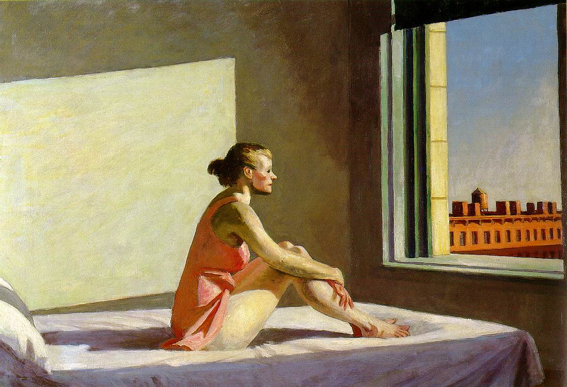
Look at this work by Edward Hopper: Morning Sun (1952): click here (external link). What are the main shapes and lines dominating the composition? (Look for vertical lines, diagonals and repeated geometric shapes.)
A diagonal runs from lower left to upper right, indicated by the shadows cast by the window on the interior wall and on the lower edge of the bed, the row of houses, and the lower edge of the blind. Vertical lines (the right-hand edge of the shadow and the vertical windowsill) divide the painting roughly into three. (Notice that the woman's back, which is roughly in line with the first of these vertical lines, and the vertical windowsill, are painted in complementary colours, pink and green, thereby further drawing our attention to the relationship between them.) Balance is provided by the repetition of a rectangular shape in the light cast on the wall by the window, and the window itself; and the bed forms a further rectangular light field linking the two other rectangles.
All of this suggests a carefully balanced composition, dominated by geometric forms: what we might term a 'closed' composition. But two elements break this. First is the figure of the woman on the bed: her body, clothing and face provide almost the only curving lines in the painting; and her weight and shadow interrupt what would otherwise be a flat plane of white on the bed.
The second element which disrupts the balance of the composition is the fact that the whole painting draws our attention to a space beyond the painting, and invites us to imagine that space as infinite. The diagonal running from left to right, which we noticed at the start of our analysis of the painting, is also matched by the gaze of the woman. Although we cannot follow her gaze, we know from the uninterrupted sunlight pouring through the window that she is looking towards the sun in an empty sky. Although the composition is quite clearly divided into three areas, there is a strong implication of a space beyond the painting, which is the object of the figure's gaze, which suggests a very 'open' composition. One of the unsettling aspects of this painting is the way it suggests infinite space, not by painting that space, but by implying it beyond the picture frame; and because Hopper suggests the figure's gaze so strongly, we cannot help but engage with it. Thus, although the painting is of a very tightly confined space, and its composition is carefully balanced within that, what Hopper actually suggests is the relationship between the person within that limited space, and the infinity outside it. It's hard not to be affected by it.
(We'll return to Hopper's interesting use of light in this painting in unit 8.)
Look at the painting by Michelangelo: the Doni tondo (c. 1506). What are the dominant lines and force lines here? Is the painting self-contained?
It is a very self-contained painting: the figures are surrounded by empty space, and their gazes are focused within the painting itself. The viewer's eye, following the gaze of any of the figures, is led to the gaze of the other figures. Even the nudes in the background create a horizontal force line, and the child looking up leads us to the gazes of the figures.This is a good example of 'closed' composition. Thus, even though the painting contains movement, it is very stable and self-contained.
Look at this work by Wassily Kandinsky, Improvisation 31 (Sea Battle) (1913): click here (external link; National Gallery of Art). Try and identify the ways in which the rhythm is being manipulated. It does not depict anything. But if we think about the way it is composed, and the way this guides our eye around the painting, we can start to experience the effect the work produces. You might also find it helpful to think about the ways in which colour guides the eye across the painting.
Whenever I've been to exhibitions of paintings by Kandinsky, I've found people have been polarized by his work. Many seem to dismiss it. But many others (and I am one of this group of people) seem utterly mesmerized by it. I'm sure that in part it's because when you take time over looking at his paintings, you start to experience the rhythm of them more fully: the gentle shifts from dark green, to light green, to yellow, to brown interrupted by strips of contrasting red; the long lines of the dark shapes, leading the eye across the painting in diagonals, but being interrupted by other dark shapes; the clean geometric patters at the top left and bottom right. And after a while, once you've stopped trying to work out what is being 'represented' in the painting, all you have is this experience of being led from one form to another, and from individual forms to the work as a whole.
The University accepts no responsibility for the content of external sites.
This resource was created with the help of a University of Leeds Faculty of Arts Enterprise Knowledge Transfer Grant.
© Matthew Treherne, School of Languages, Cultures and Societies, University of Leeds, LS2 9JT.