Activity - Colour
Look at this painting by Max Beckmann, entitled Adam and Eve (1917) - (external link). It shows Adam and Eve in the Garden of Eden, tempted by the serpent. This is a very disturbing painting; one of the reasons for this is its use of colour. Identify the colours being used by Beckmann. Is the palette limited or broad? Are there complementary colours being used, or any examples of analogous colours? What are the effects of this?
The dominant tone is a brown-grey, which is used to paint the figures of Adam and Eve, the tree, and the background. This would give unity to the painting, except that the serpent's eye is painted in a saturated red; and in Adam's hair is a small, single curved line of green. The tonal unity of the brown-grey is thus interrupted by the bold use of the complementary colours of red and green (the fact that the near-circle of green on Adam's head is a half-echo of the serpent's eye enhances the contrast still further). The clashing colours here clearly add to the sense of disharmony of the Fall of Man.
But there is another colour element in the painting: the flowers, in green and yellow, at the base of the painting. The use of analogous green and yellow creates a harmonious feel. Once you start thinking about these colours, all sorts of meanings begin to emerge. First of all, the flowers might be examples of the beauty of the garden of Eden (and the contrast with the red eye of the serpent suggests that the serpent is a jarring intrusion into the garden of Eden). Secondly, we might notice that the green on Adam's head unites Adam with the garden of Eden - reminding the painting's viewers that humankind was at one with nature in Eden. Finally, the flowers resemble lilies - which are traditionally symbols of Christ: so they might represent hope, opposing the colour of the serpent.
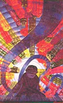
Look at this painting by the Italian Futurist artist Luigi Russolo, entitled Music and painted in 1911 - (external link).
How is the artist exploiting the different relationships between colours on the colour wheel? What effect do you think this has? How might this make you think of music, and what sort of music do you imagine?
The painting makes use of strongly contrasting complementary colours, which suggest strident, clashing musical sounds, rather than musical harmony.
Look at Monet's Haystacks at Noon, 1890-91. Try and identify the dominant colours in this painting. How do they fit on the colour wheel?
Yellow, green and violet are the dominant colours. If we consider their place on the colour wheel, we find that yellow and violet are complementaries. Notice that the complementarities are mostly located around the shadows.
Look at Seurat's Bathers at Asnières (1884). What do you notice about the use of colour? What types of colour does Seurat set alonsgide each other?
In the 1880s, Seurat experimented with 'divisionism': the idea of dividing up the perceived colour of an object. Thus the hat of the foremost bather, which appears orange, is divided into pure red, yellow, green and blue pigments. The application of these small dots of pure colour is referred to as pointillism.
In this painting, Seurat's use of colour is fundamental to the complexity of the piece. Wherever you look, you see that adjacent brushstrokes actually make use of complementary contrasts. Yellow-greens and mauves and purples in grass; orange and blue in water.
Seurat is using strongly contrasting colours on the wheel - he's picking his colours from different sides of the wheel - but then within that broad palette, he's limiting himself to quite a small number of pure colours. Gradations of colour are achieved by varying the combinations of points of colour which are applied.
Assess the use made of colour by Duccio in the Descent into Limbo in his Maestà.
We might notice the very high saturation of colour, which creates overall a brilliant effect. The colours are intense: they have not been mixed. Whilst there are touches of white on the clothing worn by the figures (this is done to depict light), on the whole the colours have a middle value - that is to say, the hues are neither mixed with white, nor with black.
The effect overall is that the colours are impressive, enjoyable in their own right. Duccio has not been concerned to make the colours 'blend', and to modern eyes the colours might seem somewhat garish, and unsubtle at first. But if you take time to get used to this different way of presenting colour, then you can start to enjoy Duccio's intense colours.
The University accepts no responsibility for the content of external sites.
This resource was created with the help of a University of Leeds Faculty of Arts Enterprise Knowledge Transfer Grant.
© Matthew Treherne, School of Languages, Cultures and Societies, University of Leeds, LS2 9JT.